前言
居中布局,是前端页面最常见的一种布局需求。刚开始学习前端时还是困扰了一段时间,后来看了Centering in CSS: A Complete Guide一文后才算掌握了方法。下面将现今自己了解的居中布局方法作个小总结。
概述
首先来看看居中布局的需求分类:
- 水平居中
- 垂直居中
- 垂直水平居中
分别的,针对不同的元素类型,行内元素还是块级元素,我们可以有不同的处理方法。这边引用mdn的文档简单说明一下行内元素与块级元素,有助于理解相应的实现原理。
行内元素:一个行内元素只占据它对应标签的边框所包含的空间。如a, img, span, button, input, label, select, textarea 等。
块级元素:块级元素占据其父元素(容器)的整个空间. 如div, h1~6, p, form, table, ul, ol 等。
当然,对于上述类型的元素,我们也可以通过设置display: inline-block的方式使其变为行内盒子,使用行内元素的方法进行居中。
下面,针对不同的布局需求,分别总结一下相应的实现方式。注意,本文所述的行内元素为display属性为inline或inline-block的元素。
水平居中
行内元素
在包含的父元素定义text-align属性为center。
优点:兼容性好,并且适用于多个inline-block元素在同一行进行居中,不用考虑各个元素的宽度问题。
浏览器兼容性:All
块级元素
在当前元素设置margin-left与margin-right属性为auto。一般简写如下:
此时的元素自然也是需要设定width属性的,否则作为块级元素,它的宽度就是100%,并不需要进行居中了。
浏览器兼容性:All
垂直居中
行内元素
使用line-height
如果内容是单行的,那么可以在包含的父元素定义相同的height与line-height一致。12345.parent {height: 20px;line-height: 20px;white-space: nowrap;}浏览器兼容性:All
使用padding
也可以使用padding属性进行居中,但使用情况条件相对有限,受外层包含元素的高度影响。1234.parent {padding-top: 20px;padding-bottom: 20px;}浏览器兼容性:All
利用伪元素
通过伪元素,使用vertical-align属性进行对齐,这个方法比较巧妙,可以用于上述方法不适用的场景。
浏览器兼容性:All
Html:123<div class="container"><p>If both of these techniques are out, you could employ the "ghost element" technique, in which a full-height pseudo element is placed inside the container and the text is vertically aligned with that.</p></div>CSS:
12345678910111213141516.container {height: 200px;background-color: #aaa;}.container::before {content: "";display: inline-block;height: 100%;width: 0;vertical-align: middle;}p {width: 300px;display: inline-block;vertical-align: middle;}效果:
块级元素
已知元素高度
绝对定位与
margin12345678910.parent {position: relative;}.child {position: absolute;top: 50%;left: 0;height: 200px;margin-top: -100px;}浏览器兼容性:All
绝对定位方法
1234567891011.parent {position: relative;}.child {position: absolute;height: 200px;top: 0;bottom: 0;left: 0;margin: auto;}此方法需要设定
height属性。浏览器兼容性:All。
未知高度
利用transform属性123456789.parent {position: relative;}.child {position: absolute;top: 50%;left: 0;transform: translateY(-50%);}浏览器兼容性:IE9+
(希望兼容IE8?可以考虑使用设置元素为inline-block,使用伪元素居中方法。)
垂直水平居中
对于这个问题,可以综合上述1、2点进行实现。
行内元素
使用text-align与line-height属性即可。
块级元素
已知高度与宽度
使用absolute+margin方法。
123456789101112.parent {position: relative;}.child {position: absolute;top: 50%;left: 50%;height: 200px;width: 200px;margin-top: -100px;margin-left: -100px;}绝对定位居中方法:
123456789101112.parent {position: relative;}.child {position: absolute;height: 200px;top: 0;bottom: 0;left: 0;right: 0;margin: auto;}
未知高度与宽度
使用transform方法:123456.parent {position: absolute;top: 50%;left: 50%;transform: translate(-50%, -50%);}
其他居中方法
前三节中的方法是相对来说使用率较高的方法,并且有较好的兼容性。除此之外,还有一些方法也可以实现居中。
使用float实现水平居中
Html:
CSS:
效果:
使用flex
不考虑兼容性的情况下,flex可以轻松实现水平与垂直居中
使用table
使用table也具有良好的兼容性,但是table布局会带来页面重排性能的问题,所以一般都不采用。
使用calc计算属性
使用CSS3的calc属性,基于当前的页面的布局计算尺寸。
兼容性:IE9+
Html:
CSS:
效果: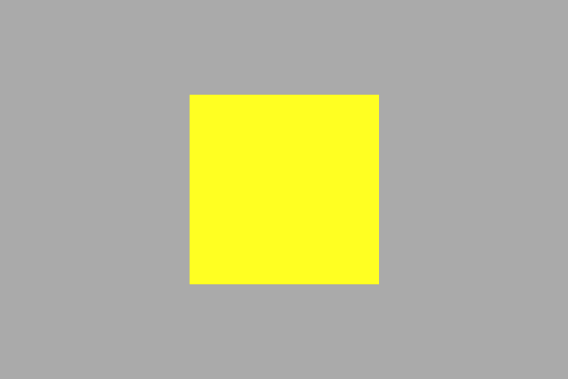
参考文章
- Centering in CSS: A Complete Guide
- 盘点8种CSS实现垂直居中水平居中的绝对定位居中技术
- Absolute Horizontal And Vertical Centering In CSS
- 六种实现元素水平居中
第一篇技术文章,就写到这里啦^_^。